Website design and development for a business that provides training and staffing solutions.
My Role:
Branding Development, UI/UX Design, Visual Design, Front End Development
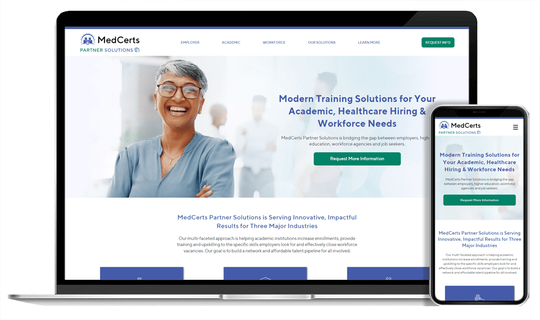
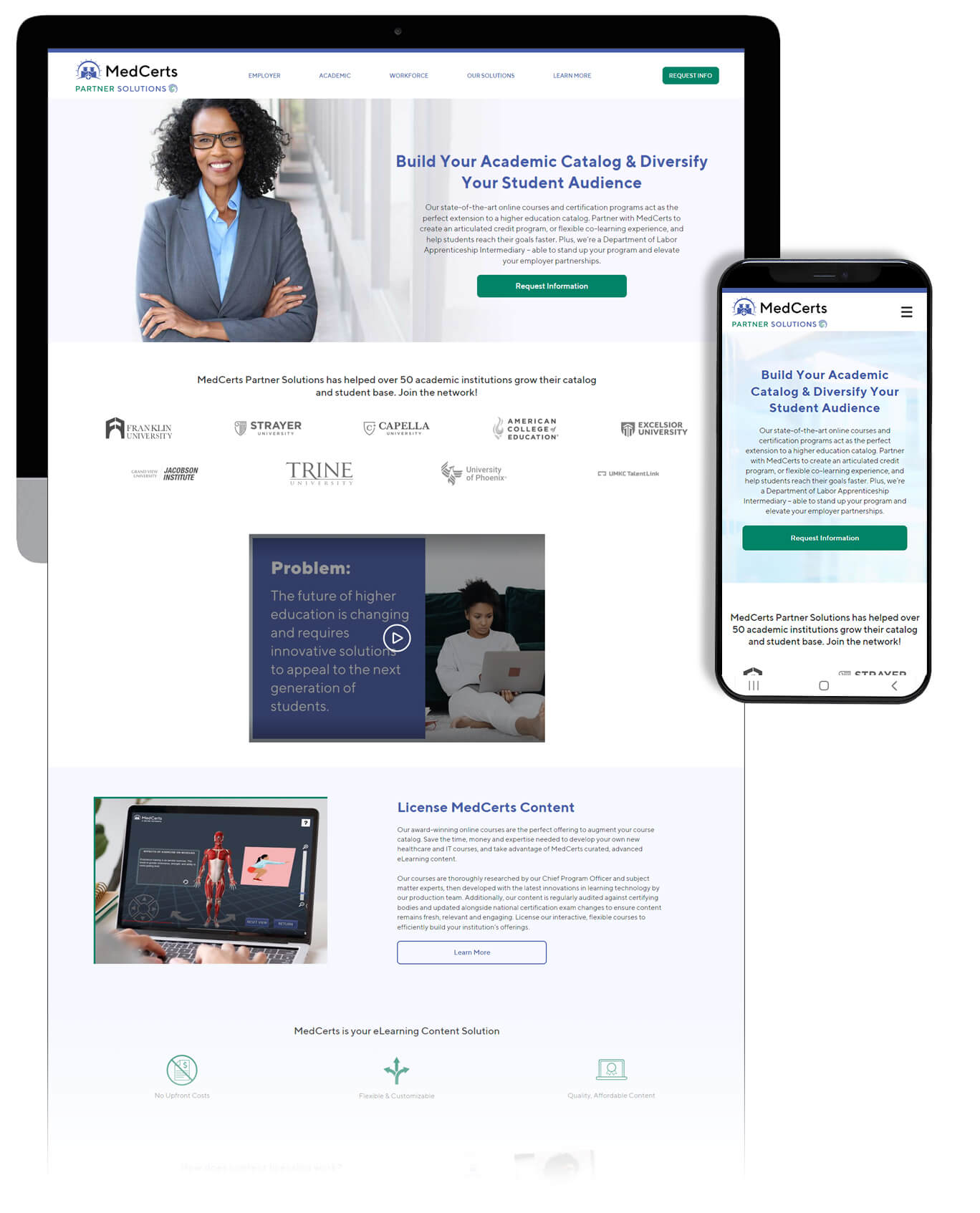
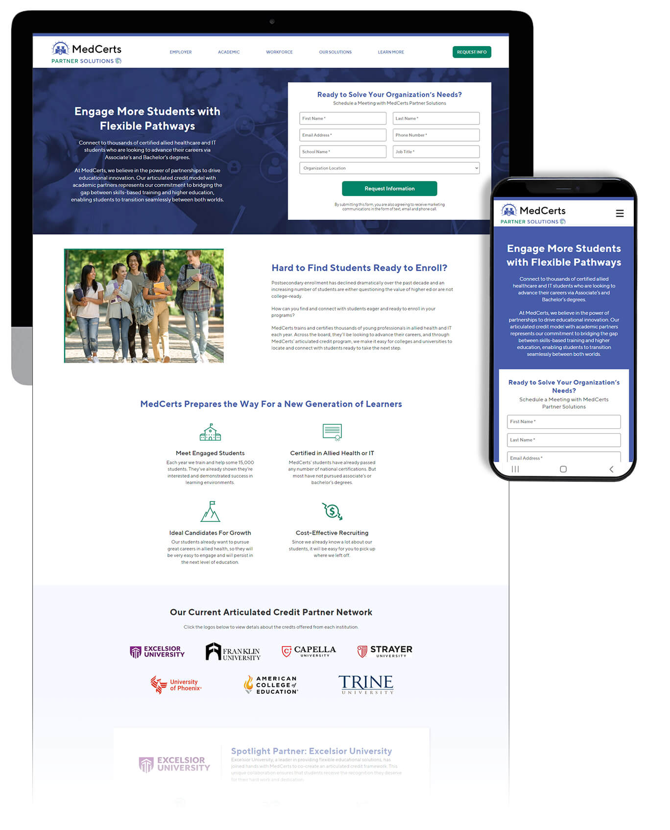
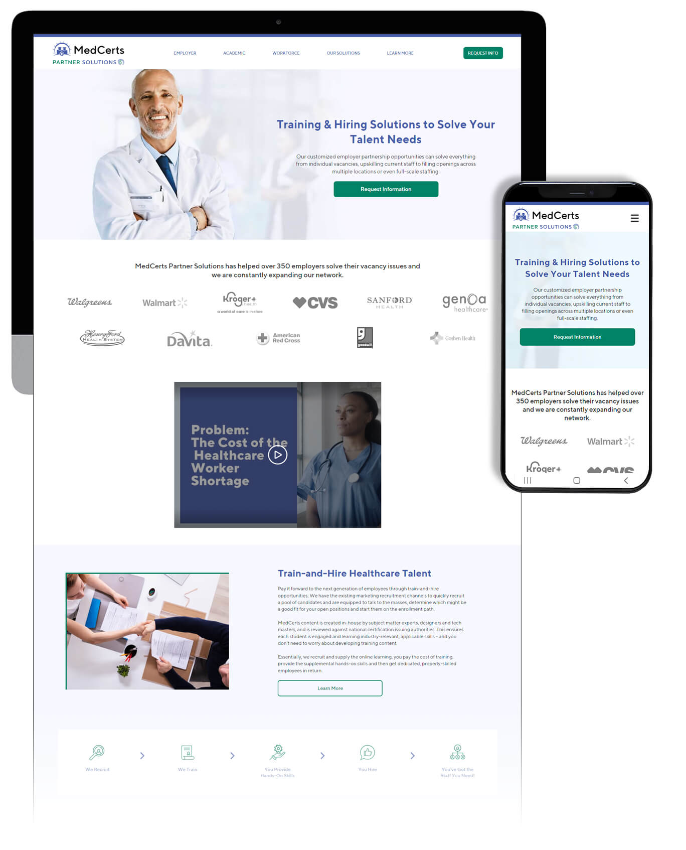
MedCerts, a company that provides occupational training programs, was expanding the side of their business that works with external B2B partners. The information pertaining to this side of the business was beginning to cloud the focus of their B2C site.
My team created branding and designed and built a site dedicated to the B2B side of their business. The primary objective was conveying information that led to lead genaration.
The decision was made to keep the MedCerts logo for brand recognition while adding a new Partner Solutions element to it. The logomark represents the targeted, dynamic solutions that MedCerts provides to its partners. The brand colors feature a dark blue that MedCerts has used for years in order to tie the two brands together, along with a new green CTA color.
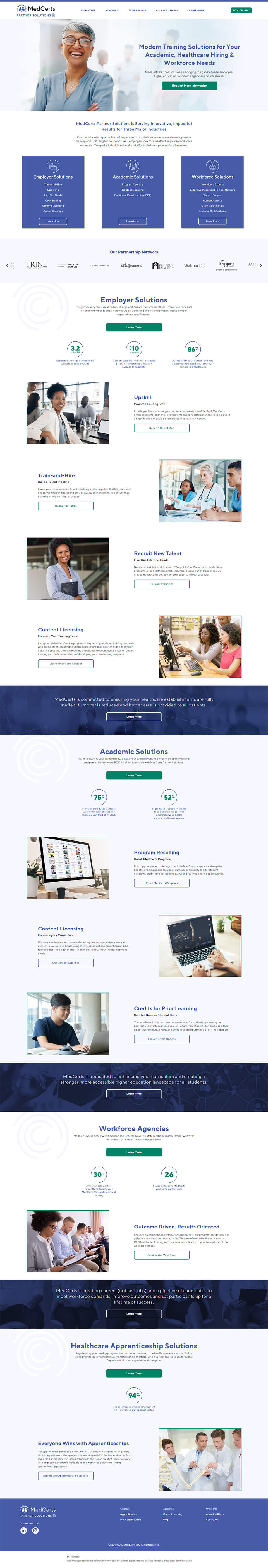
The company focuses on three separate customer bases, employer, academic, and workforce agencies. Care was taken to clearly delineate the three at the top of the page while including separate sections for each to ensure SEO focused content was present throughout.
An emphasis was placed on simplifying the most important information in order to present easy to digest content.